FRFCU: Making Banking Fun Again


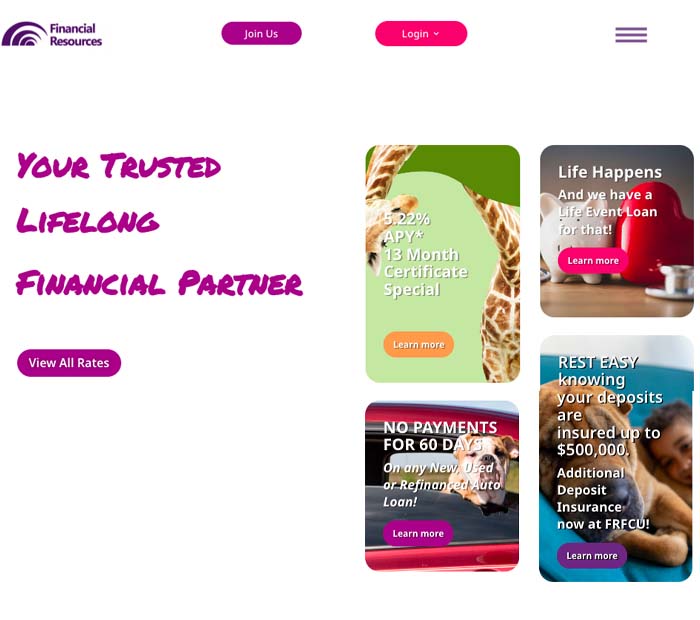
Original home page of myfinancialresources.org vs. the new design
The Brief
A credit union based in New Jersey with a diverse membership and lots of banking options, FRFCU wanted a new look for their site which would break the stereotype of the formal, staid bank and create a fun and engaging experience for their customers.

The Process
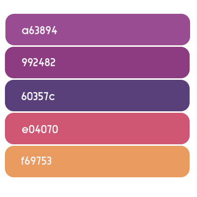
The client wanted to convey their updated image with a bright saturated palette and animated text. This was a fairly large WordPress site with a lot of sections, so the visual design had to cue the user about which section they were in.
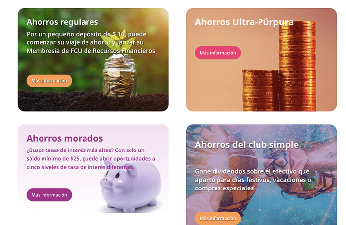
The bank also wanted to utilize a third party translation service so care was needed to ensure that translated text would not break the pages’ layouts.
A visual system of “tiles” which became a solid color when hovered over was used to make information accessible while staying within the concept of “fun” banking. Since the site would be handed over to the credit union’s marketing manager, the WordPress theme’s library feature was utilized to make it easy for layouts to be recycled and edited as needed.


The Outcome
The finalized site was launched with a new look and a more streamlined site architecture. By organizing strong imagery with the color palette and bold typography, clients were able to have a clearer customer journey with a fun and energetic vibe.
