Revamping A Photographer’s Image
The Brief
Ilene Perlman is a documentary photojournalist as well as a fine art photographer who was ready for a site makeover.
Her original site was difficult to navigate and a recent software update had made many of the site’s gallery images disappear.
I was asked to create more intuitive navigation so users could move from the home page to individual galleries with as few clicks as possible. It was also important to Ilene that users understand how to move from gallery to gallery without feeling unsure of where they were in the site.

The Process
The project began with collecting all the images that were on the original site, resizing them for the web and sorting them out into the galleries that Ilene wanted for the new site.
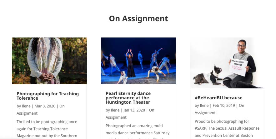
After getting site architecture and the user flow figured out, I developed a masonry style layout for the galleries so users could see portrait and landscape images together.
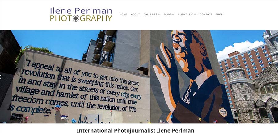
Ilene also needed a new logo so one was created using her brand colors of plum and olive green.


home page gallery navigation showing hover effect with link
The Outcome
The site was relaunched with a brand new navigation system plus new features such as hover-boxes for main categories and masonry-style layouts for individual galleries.
The site makes it much easier for prospective clients to see Ilene’s work, even on a phone. Plus, the updated backend makes updating the site’s content a breeze.
